- 前端工程师手册
- 介紹
- 1. HTML/CSS基础
- 2. HTML/CSS进阶
- 3. JavaScript基础
- 4. JavaScript进阶
- 5. JavaScript面向对象
- 6. JavaScript设计模式
- 7. 编写JavaScript框架
- 8. JavaScript模块管理
- 9. JavaScript数据结构
- 10. JavaScript异步编程
- 11. JavaScript正则表达式
- 12. jQuery相关
- 13. GSAP相关
- 14. 网络相关
- 15. 跨域问题
- 16. 调试与测试
- 17. 前端自动化
- 18. SPA
- 19. 理解架构
- 20. 前后端分离
- 21. UI
- 22. UX
- 23. 动画相关
- 24. 原理性质
- 25. 性能优化
- 26. web开发中的坑or技巧
- 27. 前端面试
- 28. 参考资料
CSS常见布局
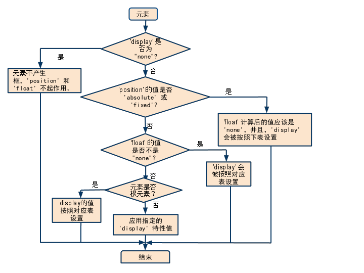
'display', 'position', and 'float'三者对布局的影响
The three properties that affect box generation and layout — 'display', 'position', and 'float' — interact as follows: If 'display' has the value 'none', then 'position' and 'float' do not apply. In this case, the element generates no box. Otherwise, if 'position' has the value 'absolute' or 'fixed', the box is absolutely positioned, the computed value of 'float' is 'none', and display is set according to the table below. The position of the box will be determined by the 'top', 'right', 'bottom' and 'left' properties and the box's containing block. Otherwise, if 'float' has a value other than 'none', the box is floated and 'display' is set according to the table below. Otherwise, if the element is the root element, 'display' is set according to the table below, except that it is undefined in CSS 2.1 whether a specified value of 'list-item' becomes a computed value of 'block' or 'list-item'. Otherwise, the remaining 'display' property values apply as specified.
一张图:
常见布局
固定尺寸
布局可以从固定尺寸先了解,先构思好页面的主要结构,做动画的元素一般需要绝对定位,方便操作移动。
自适应布局
响应式的布局的结构其实就是多个固定尺寸的组合,元素的宽度,字体的大小一般会以半分比的形式设置。通过媒体查询进行不同分辨率下的布局。
布局方式
居中设置
关于居中,要学会设置水平居中和垂直居中。参考文章:如何只用CSS做到完全居中。